Rguroo’s data visualization tools make the power of R graphics accessible by simple point-and-click to produce presentation-quality graphs. Each graph has a “Basics” and “Details” menus. The “Basics” menu provides a simple to use interface to create a graph quickly. The “Details” menus offer many options to customize your plots to their nitty-gritty details. You can set the size and resolution of your figures and export them in various formats PNG, JPEG, BMP, or SVG.
Data Visualization

Graph Customization
Customize the title by selecting colors, fonts, and adjusting position.
Customize x- and y- axes line type, limits, scales, labels, tick marks, positions and colors.
Customize legends and place them at specific coordinates or locations.
Add vertical and horizontal grids with your choice of locations, line-types, and color.
Select the image size and image type from one of png, jpeg, bmp, and svg.
Customize your plot frame, image frame, and plot and image margins.
Superimpose your graphs with text, lines, or curves.
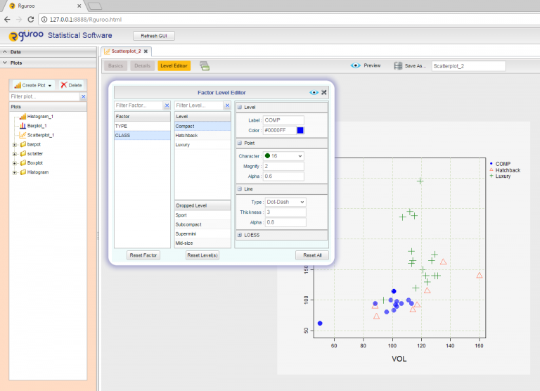
Factor Level Editor
Categorical variables in Rguroo are referred to as factors. Rguroo’s Factor Level Editor allows you to set attributes for each level of a factor in your plots. You can specify labels, point colors, line colors, plot characters, line types, line thickness, and plot character size. You can reorder bars, and color the bars in barplots. Similarly, in boxplots you can reorder box-and-whiskers and select colors for them. In plot-by-group cases, reorder plots, and specify titles and other attributes for each plot using the Factor Level Editor.
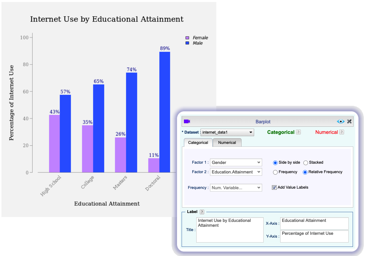
Barplot
Graph a single categorical variable, or two categorical variables either from raw data or a frequency table.
Graph means or sums of numerical variables by factors.
Add confidence bars or error bars of your choice when displaying numerical variables.
Add confidence bars or error bars for barplots with means and sums of numerical variables.
Use the options side-by-side or stacked bar plots.
Customize the bars’ aesthetics using the “Details” menu and the Level Editor.
Add customizable value labels on top of each bar, indicating frequencies, relative frequencies, percentages, sums, or means.
Remove or reorder bars, using the Factor Level Editor.
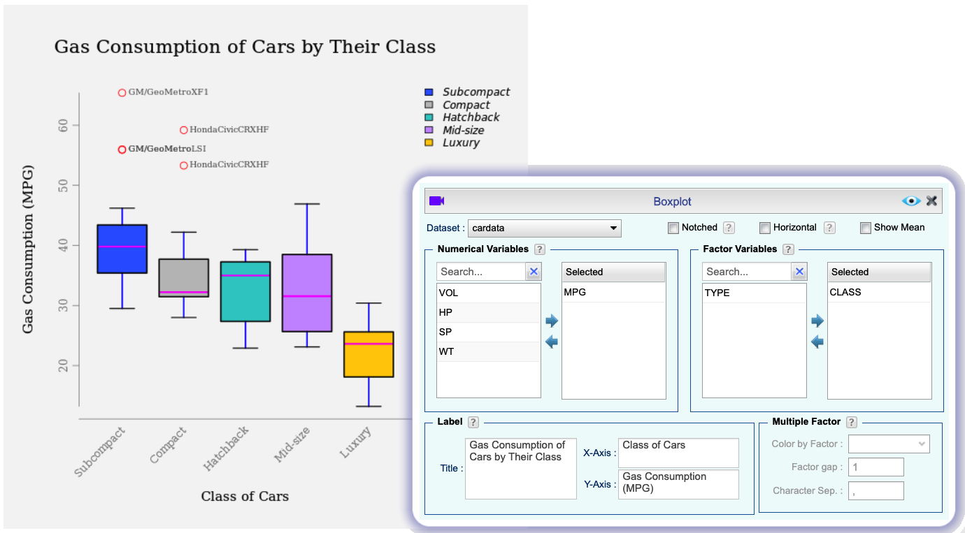
Boxplot
Make boxplot using any combination of numerical variables and categorical variables.
Customize components of the boxplot, including the box, median, whisker, staples, and the outliers.
Identify and annotate outliers.
Draw notched boxplots to depict confidence intervals for the median.
Remove and/or reorder boxplots, using the Factor Level Editor.
Use “sunflower” graph to show multiple outliers at a given point.
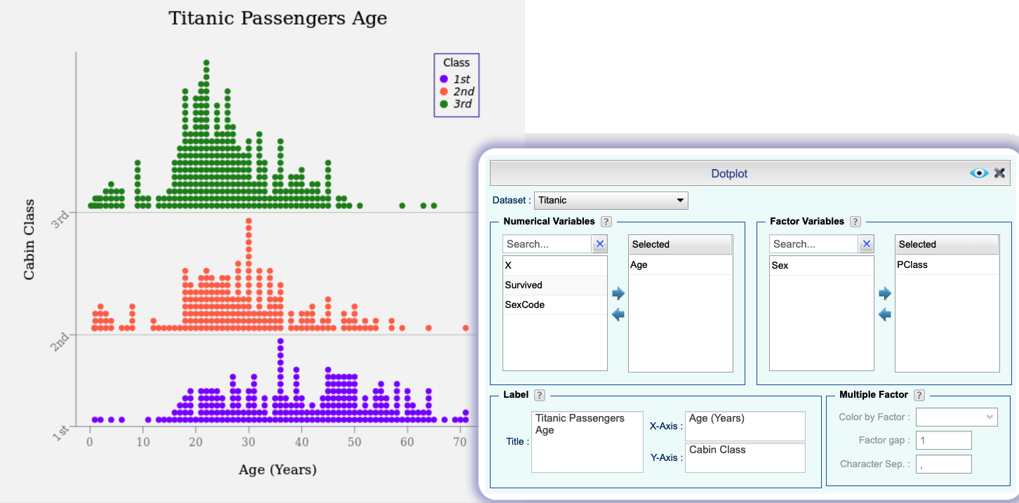
Dotplot
Make dotplots of numerical variables.
Select point characters, size, and color.
Identify points by using different colors or point characters.
Remove and/or reorder dotplots for levels of a factor, using the Factor Level Editor.
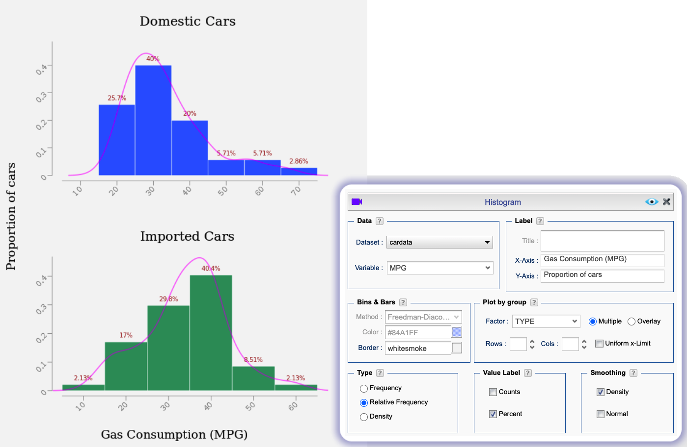
Histogram
Plot density, frequency, or a relative frequency histograms.
Plot histograms for a numerical variable by levels of a factor variable, either as multiple plots or overlaid histograms.
Place value labels including frequencies, proportions, or percentages on top of each bar.
Superimpose the histograms by density curves and/or bell-shaped curves.
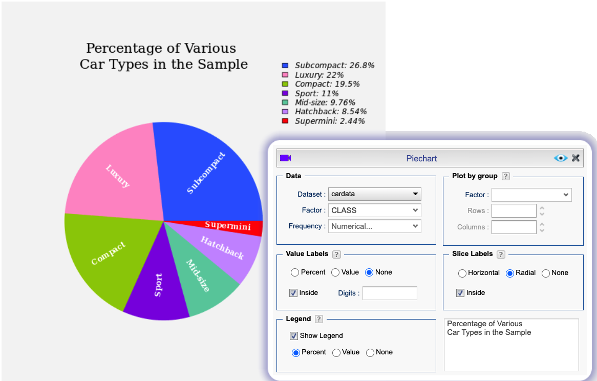
Pie Charts
Plot pie charts, color, and reorder pie slices.
Show or hide counts and percentages on legends or slices.
Plot pie charts by levels of a factor.
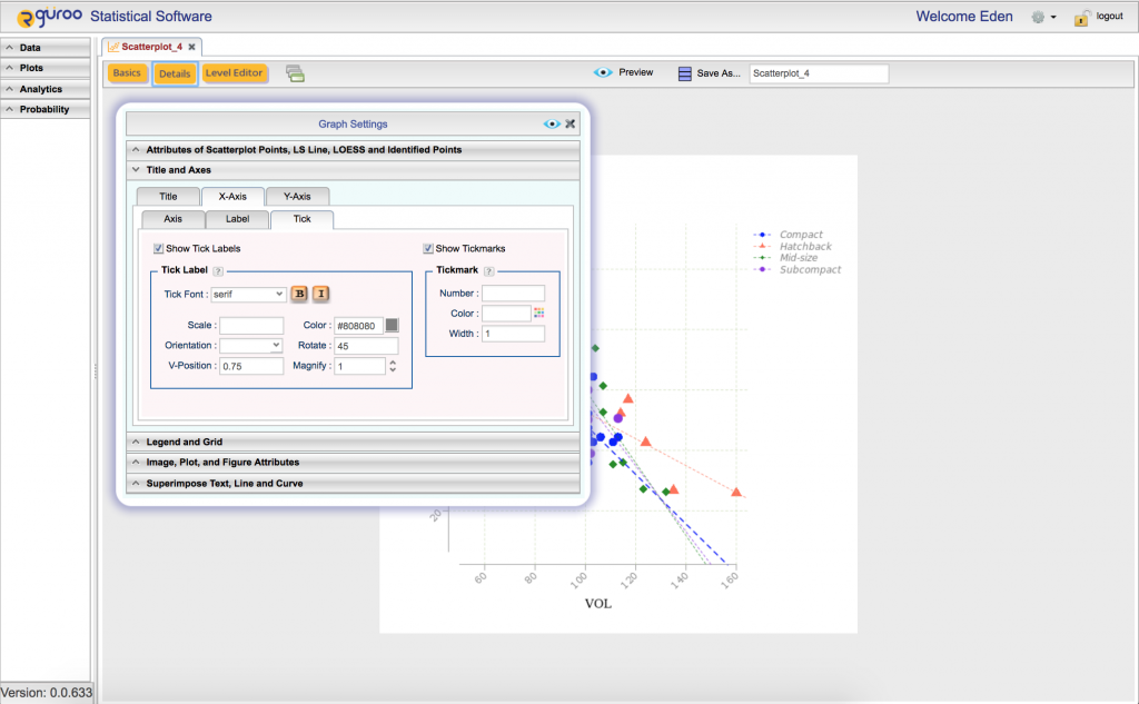
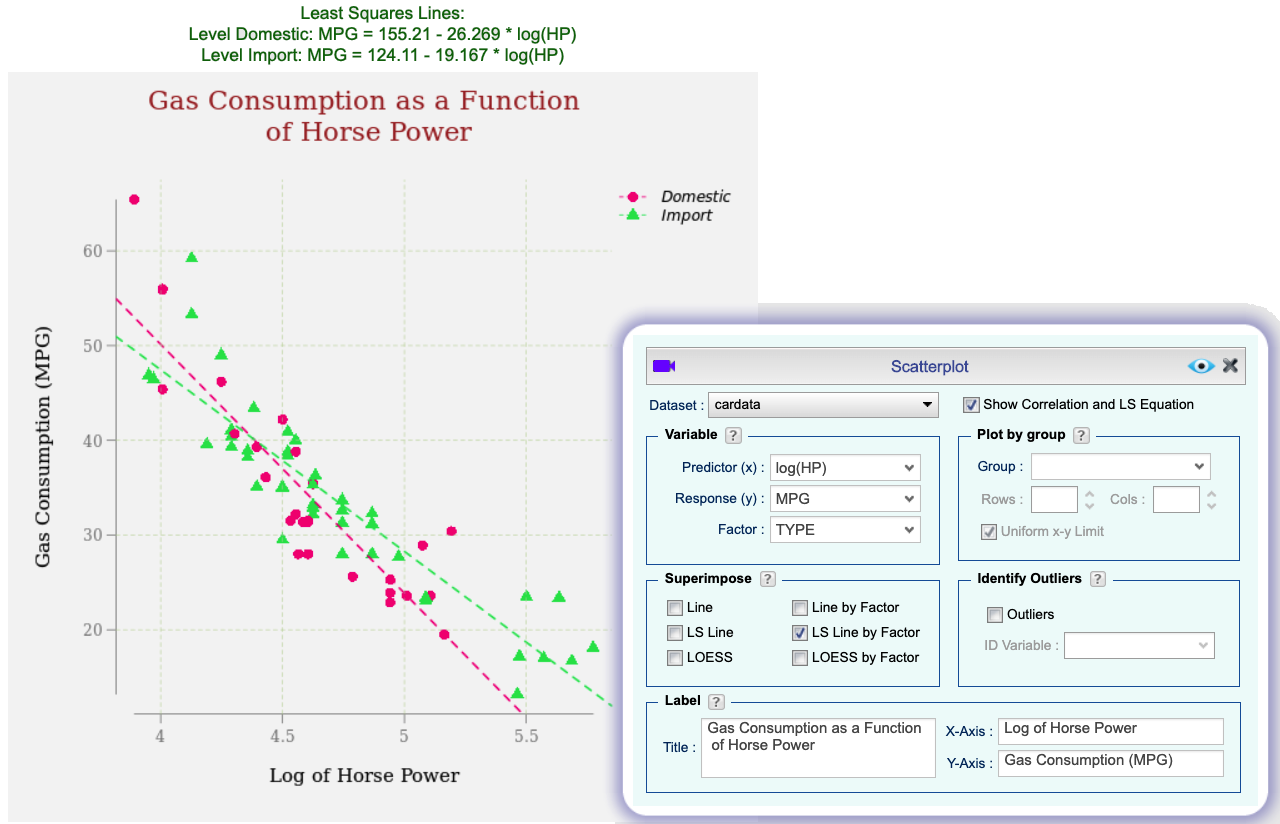
Scatterplot
Select from a variety of plot characters and customize their size and colors.
Draw scatterplots by levels of a factor and custom arrange them.
Draw time plots by using the Line option.
Superimpose scatterplots by a least-squares line or a LOESS curve.
Transform the x and y variables.
Identify outliers by various methods.
Identify and mark specific cases on the plot.
Select the factor levels to be displayed using the Factor Level Editor.
Customize point and line colors and types for each level of a factor using the Factor Level Editor.
Show or hide correlation coefficients and equation of the least-squares line
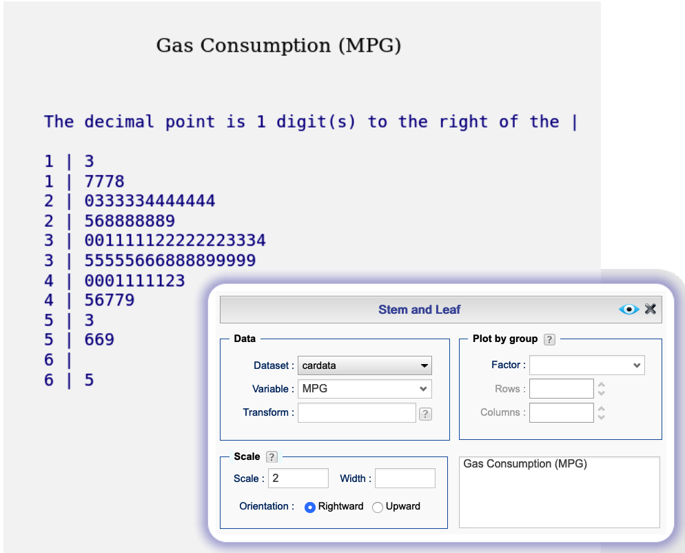
Stem and Leaf
Plot stem and leaf display of your numerical data with your choice of scale.
Plot stem and leaf displays by levels of a factor.
Customize the font, color, and size of the characters.